How to Build Multi-Step Form with Progress Stepper in React
Published on: 25th May 2025

Multi-step forms are widely used in modern web applications such as e-commerce checkouts, onboarding flows, job application systems, and more. They break a large form into smaller, manageable steps, significantly improves user experience and completion rates.
In this guide, you’ll learn how to create a multi-step form with a progress stepper using React.js and Tailwind CSS, ideal for forms like laptop requests for students. You can easily repurpose this structure for other use cases by updating the form fields.
We’ll use UI components from Flexy UI, a modern UI library, to save development time and maintain a consistent design.
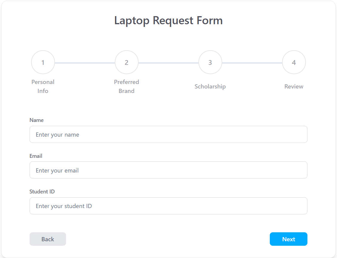
What You’ll Build
A four step form for a Student Laptop Request Application:
- Personal Information – Basic student details.
- Laptop Requirements – Checkbox inputs for preferred brand.
- Eligibility Verification – Textarea input for financial explanation.
- Review & Submit – Summary of responses.
This is how our app UI looks like.
Step 1: Set Up Your React Project
We'll start by creating a new React app using Vite:
1npm create vite@latest
- Choose a project name (e.g.,
multi-step). - Select the React template.
- Choose TypeScript for better code quality.
- Navigate into the project directory:
1cd multi-step
- Install the dependencies:
1npm install
Step 2: Install and Configure Tailwind CSS
We’ll use Tailwind CSS v4 for styling. Follow the official installation guide here:
👉 Tailwind with Vite - Official Docs
Just follow the 5 steps mentioned in this doc and you’re done with installing Tailwind CSS.”
Step 3: Organizing Project Folder Structure
A scalable folder structure helps you maintain and scale your project easily. Here’s a recommended structure inside src/:
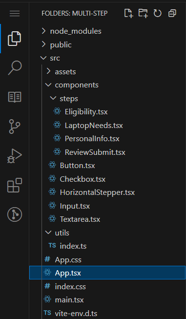
For all the steps, we create a file inside the /components/steps folder so that we can easily add more steps later.
This structure keeps your logic modular and your components reusable.
Step 4: Creating Reusable UI Components
Before building our multi-step form, we need to create reusable UI components that we'll use throughout our application.
Input Component
The Input component handles text input fields with proper TypeScript typing and Tailwind styling:
1import clsx from 'clsx'
2import { ChangeEvent } from 'react'
3
4interface InputProps {
5  type: 'text' | 'number' | 'email' | 'password'
6  label?: string
7  value: string | number
8  name: string
9  placeholder: string
10  error?: string
11  disabled?: boolean
12  onChange: (e: ChangeEvent<HTMLInputElement>) => void
13  icon?: React.ReactNode
14}
15
16const Input: React.FC<InputProps> = ({
17  type,
18  name,
19  disabled,
20  placeholder,
21  label,
22  value,
23  onChange,
24  error,
25  icon,
26  ...props
27}) => {
28  return (
29    <div className="mb-6">
30      {label && (
31        <label htmlFor={name} className="mb-1.5 block text-sm font-medium text-zinc-500">
32          {label}
33        </label>
34      )}
35      <div className="relative flex items-center">
36        {icon && <span className="absolute left-3 text-[#667085]">{icon}</span>}
37        <input
38          type={type}
39          name={name}
40          id={name}
41          placeholder={placeholder}
42          value={value}
43          onChange={onChange}
44          disabled={disabled}
45          className={clsx(
46            'w-full rounded-lg border border-[#D0D5DD] px-4 py-2.5 text-gray-700 placeholder:text-[#667085] focus:border-blue-200 focus:ring-2 focus:ring-blue-200 focus:outline-hidden',
47            { 'pl-10': icon, 'ring-2 ring-red-200': error },
48          )}
49          {...props}
50        />
51      </div>
52      {error && <p className="mt-1 ml-3 text-sm text-red-600">{error}</p>}
53    </div>
54  )
55}
56
57export default Input
We have also created login and signup form pages using above input components.
Button Component
A flexible button component that handles different styles and variants:
1import React, { MouseEventHandler, ReactNode } from 'react'
2import { cn } from '../utils'
3
4interface ButtonProps {
5  children: ReactNode
6  variant?: 'primary' | 'secondary' | 'outline'
7  loading?: boolean
8  disabled?: boolean
9  type?: 'button' | 'submit' | 'reset'
10  onClick?: MouseEventHandler<HTMLButtonElement>
11  className?: string
12}
13
14const Button: React.FC<ButtonProps> = ({
15  children,
16  variant = 'primary',
17  loading = false,
18  disabled = false,
19  type = 'button',
20  onClick,
21  className,
22}) => {
23  const baseStyles =
24    'h-9 rounded-lg py-2 px-4 font-medium transition duration-300 ease-in-out inline-flex items-center justify-center gap-2 disabled:bg-gray-200 disabled:text-gray-500 disabled:cursor-not-allowed disabled:border-gray-300'
25
26  const variantStyles: Record<string, string> = {
27    primary: 'bg-[#00AAFF] text-white hover:bg-sky-600 border border-transparent',
28    secondary: 'bg-[#EBEEF7] text-[#191F33] hover:bg-violet-200 border border-transparent',
29    outline: 'bg-transparent text-[#7D8592] border border-[#D8E0F0] hover:bg-[#D8E0F0]',
30  }
31
32  return (
33    <button
34      className={cn(baseStyles, !disabled && variantStyles[variant], className)}
35      disabled={disabled || loading}
36      onClick={onClick}
37      type={type}
38    >
39      {children}
40    </button>
41  )
42}
43
44export default Button
Checkbox Component
We are using checkbox component for handling multiple selections in our laptop requirements step:
1interface PropsType {
2  label: string
3  id?: string
4  name?: string
5  value?: string
6  checked: boolean
7  handleChange: React.ChangeEventHandler<HTMLInputElement>
8  disabled?: boolean
9}
10
11const Checkbox: React.FC<PropsType> = ({
12  label,
13  id = 'default-checkbox',
14  name,
15  value,
16  checked,
17  handleChange,
18  disabled = false,
19}) => {
20  return (
21    <div className="relative flex items-center gap-2">
22      <input
23        type="checkbox"
24        id={id}
25        name={name}
26        value={value}
27        onChange={handleChange}
28        checked={checked}
29        disabled={disabled}
30        className="size-6 transform cursor-pointer appearance-none rounded-lg border-2 border-gray-400 transition duration-120 ease-in-out checked:border-none checked:border-[#CC76A1] checked:bg-[#CC76A1] disabled:cursor-not-allowed disabled:opacity-50"
31        aria-checked={checked}
32      />
33      <label htmlFor={id} className="cursor-pointer text-sm font-medium text-zinc-400">
34        {label}
35      </label>
36      {checked && (
37        <span className="pointer-events-none absolute top-[-4px] left-[7px] scale-x-[-1] rotate-35 transform text-lg font-bold text-white">
38          L
39        </span>
40      )}
41    </div>
42  )
43}
44
45export default Checkbox
Textarea Component
We selected textarea component from Flexy UI for longer text inputs like eligibility explanations:
1import { ChangeEvent, TextareaHTMLAttributes, useEffect, useRef } from 'react'
2
3interface TextAreaProps extends TextareaHTMLAttributes<HTMLTextAreaElement> {
4  label?: string
5  value: string
6  onChange: (e: ChangeEvent<HTMLTextAreaElement>) => void
7  placeholder?: string
8  autoHeight?: boolean // Enable auto-height adjustment
9  resize?: 'none' | 'both' | 'horizontal' | 'vertical' // Control resizing
10  className?: string // Allow custom classes
11}
12
13export const TextArea: React.FC<TextAreaProps> = ({
14  label,
15  value,
16  onChange,
17  placeholder = 'Enter text...',
18  autoHeight = true,
19  resize = 'vertical',
20  className = '',
21  ...props
22}) => {
23  const textAreaRef = useRef<HTMLTextAreaElement | null>(null)
24
25  useEffect(() => {
26    if (autoHeight && textAreaRef.current) {
27      textAreaRef.current.style.height = 'auto' // Reset height
28      textAreaRef.current.style.height = `${textAreaRef.current.scrollHeight}px` // Adjust to content
29    }
30  }, [value, autoHeight])
31
32  return (
33    <div className={`w-full ${className}`}>
34      {label && <label className="mb-2 block text-sm font-medium text-zinc-500">{label}</label>}
35      <textarea
36        ref={textAreaRef}
37        value={value}
38        rows={7}
39        onChange={onChange}
40        placeholder={placeholder}
41        className={`w-full rounded-lg border border-[#DCDFEA] bg-white p-3 text-sm placeholder:text-[#9C9C9C] focus:border-blue-300 focus:ring-1 focus:ring-blue-300 focus:outline-hidden ${resize === 'none' ? 'resize-none' : ''} ${resize === 'both' ? 'resize' : ''} ${resize === 'horizontal' ? 'resize-x' : ''} ${resize === 'vertical' ? 'resize-y' : ''} `}
42        style={{ resize }}
43        {...props}
44      />
45    </div>
46  )
47}
48
49export default TextArea
Building the Horizontal Stepper Component
The horizontal stepper provides visual feedback about the user's progress through the form. This component displays the current step and allows users to understand how much of the process they've completed.
1interface Step {
2  label: string
3  step: number
4}
5
6interface StepperProps {
7  steps: Step[]
8  activeStep: number
9}
10
11const Stepper: React.FC<StepperProps> = ({ steps, activeStep }) => {
12  const totalSteps = steps.length
13  const width = `${(100 / (totalSteps - 1)) * (activeStep - 1)}%`
14
15  return (
16    <div className="mx-auto w-full max-w-3xl px-4">
17      <div className="before:transform-y-1/2 relative flex justify-between before:absolute before:top-1/2 before:left-0 before:h-1 before:w-full before:bg-slate-200">
18        {steps.map(({ step, label }) => (
19          <div className="relative z-10" key={step}>
20            <div
21              className={`flex size-16 items-center justify-center rounded-full border-2 border-zinc-200 bg-white transition-all delay-200 ease-in ${
22                activeStep >= step ? 'border-slate-400' : ''
23              }`}
24            >
25              {activeStep > step ? (
26                <div className="-scale-x-100 rotate-45 text-2xl font-semibold text-slate-400">
27                  L
28                </div>
29              ) : (
30                <span className="text-lg font-medium text-zinc-400">{step}</span>
31              )}
32            </div>
33            <div className="absolute top-24 left-1/2 -translate-x-2/4 -translate-y-2/4">
34              <span className="inline-block text-center font-semibold text-zinc-400">{label}</span>
35            </div>
36          </div>
37        ))}
38        <div
39          className="transform-y-1/2 absolute top-1/2 left-0 h-1 w-full bg-slate-400 transition-all delay-200 ease-in"
40          style={{ width: width }}
41        ></div>
42      </div>
43    </div>
44  )
45}
46
47export default Stepper
Flexy UI provides accessible and responsive components you can customize as needed.
💡 Tip: Refer to Flexy UI’s documentation for different variants of these components to fit your design needs.
Step 5: Creating UI Components for Form Steps
Our form has 4 steps, and each step of the form will be a separate component inside the steps/ folder.
This structure will help us scale and maintain the app in the future.
Step 1: Personal Information
This step requires 3 inputs:
- Name (Text input)
- Email (Text input)
- Student ID (Text input)
1import Input from '../Input'
2
3interface PersonalInfoProps {
4  name: string
5  email: string
6  studentId: string
7  onChange: (e: React.ChangeEvent<HTMLInputElement>) => void
8}
9
10const PersonalInfo: React.FC<PersonalInfoProps> = ({ name, email, studentId, onChange }) => {
11  return (
12    <div className="space-y-4">
13      <Input
14        type="text"
15        name="name"
16        label="Name"
17        placeholder="Enter your name"
18        value={name}
19        onChange={onChange}
20      />
21      <Input
22        type="email"
23        name="email"
24        label="Email"
25        placeholder="Enter your email"
26        value={email}
27        onChange={onChange}
28      />
29      <Input
30        type="text"
31        name="studentId"
32        label="Student ID"
33        placeholder="Enter your student ID"
34        value={studentId}
35        onChange={onChange}
36      />
37    </div>
38  )
39}
40
41export default PersonalInfo
Step 2: Laptop Requirements
In this step, we ask students about their preferred laptop brand:
- Preferred Brand (Checkboxes):
- Apple
- Dell
- HP
- Lenovo
1import Checkbox from '../Checkbox'
2
3interface LaptopNeedsProps {
4  selectedBrands: string[]
5  onChange: (e: React.ChangeEvent<HTMLInputElement>) => void
6}
7
8const LaptopNeeds: React.FC<LaptopNeedsProps> = ({ selectedBrands, onChange }) => {
9  const brands = ['Apple', 'Dell', 'HP', 'Lenovo']
10
11  return (
12    <div className="space-y-3">
13      <p className="text-sm font-medium text-zinc-500">Preferred Brand</p>
14
15      {brands.map((brand) => (
16        <Checkbox
17          key={brand}
18          id={brand.toLowerCase()}
19          name="LaptopNeeds"
20          value={brand}
21          label={brand}
22          checked={selectedBrands.includes(brand)}
23          handleChange={onChange}
24        />
25      ))}
26    </div>
27  )
28}
29
30export default LaptopNeeds
Step 3: Eligibility Verification
In this step, the student must explain why they need a laptop.
- Scholarship Status (Textarea):
- Example: “Explain why you need financial assistance for a laptop.”
1import React, { ChangeEvent } from 'react'
2import { TextArea } from '../Textarea'
3
4interface EligibilityProps {
5  scholarshipStatus: string
6  onChange: (field: 'scholarshipStatus', value: string) => void
7}
8
9const Eligibility: React.FC<EligibilityProps> = ({ scholarshipStatus, onChange }) => {
10  const handleChange = (e: ChangeEvent<HTMLTextAreaElement>) => {
11    onChange('scholarshipStatus', e.target.value)
12  }
13
14  return (
15    <div className="space-y-3">
16      <TextArea
17        label="Scholarship Status"
18        value={scholarshipStatus}
19        onChange={handleChange}
20        placeholder="Explain why you need financial assistance for a laptop"
21        autoHeight={true}
22        resize="vertical"
23      />
24    </div>
25  )
26}
27
28export default Eligibility
Step 4: Review & Submit
This is the last step. Here, the student can review all the information provided and submit the form.
- Display a summary of selected options.
1interface ReviewSubmitProps {
2  formData: {
3    personalInfo: {
4      name: string
5      email: string
6      studentId: string
7    }
8    laptopNeeds: string[]
9    scholarshipStatus: string
10  }
11}
12
13const ReviewSubmit: React.FC<ReviewSubmitProps> = ({ formData }) => {
14  const { personalInfo, laptopNeeds, scholarshipStatus } = formData
15  const { name, email, studentId } = personalInfo
16
17  return (
18    <div className="space-y-4 rounded-lg border border-gray-300 p-4">
19      <h2 className="text-lg font-semibold">Review & Submit 📩</h2>
20      <div className="space-y-2">
21        <p>
22          <strong>Name:</strong> {name}
23        </p>
24        <p>
25          <strong>Email:</strong> {email}
26        </p>
27        <p>
28          <strong>Student ID:</strong> {studentId}
29        </p>
30        <p>
31          <strong>Preferred Brands:</strong>{' '}
32          {laptopNeeds.length > 0 ? laptopNeeds.join(', ') : 'None'}
33        </p>
34        <p>
35          <strong>Scholarship Status:</strong> {scholarshipStatus}
36        </p>
37      </div>
38    </div>
39  )
40}
41
42export default ReviewSubmit
We are creating each of these components as standalone files:
PersonalInfo.tsx, LaptopNeeds.tsx, Eligibility.tsx, and ReviewSubmit.tsx.
It time to connect all the steps, with horizontal stepper, if you like you can also use vertical stepper.
Last Step: Bringing It All Together in App.tsx
In this final step, we assembled all the individual form components, and making it functional by adding state and logics.
Step Navigation
We used a useState hook to track the current activeStep. Based on this value, we conditionally rendered the corresponding form component:
1const [activeStep, setActiveStep] = useState<number>(1)
Navigation between steps is handled by two functions:
nextStep(): move to the next step or submits the form if it's the last step.prevStep(): Goes back to the previous step.
1const nextStep = () => {
2  if (activeStep === steps.length) {
3    // Submit form logic
4  } else {
5    setActiveStep((prev) => prev + 1)
6  }
7}
State Management for Form Data
We stored each step’s form data using dedicated pieces of state:
personalInfo: Stores name, email, and student ID.laptopNeeds: An array of selected laptop brands.scholarshipStatus: A text explanation of the student's financial need.
These are updated using controlled inputs and onChange handlers:
1const handlePersonalInfoChange = (e: ChangeEvent<HTMLInputElement>) => { ... }
2const handlePreferredBrandChange = (e: ChangeEvent<HTMLInputElement>) => { ... }
3const handleScholarshipChange = (_field: string, value: string) => { ... }
Component Composition
Each form step was built as a separate, reusable component and imported into the main App.tsx file:
PersonalInfoLaptopNeedsEligibilityReviewSubmit
Each component received only the relevant data and handlers via props, following best practices for clean and maintainable code.
1{activeStep === 1 && <PersonalInfo {...} />}
2{activeStep === 2 && <LaptopNeeds {...} />}
3{activeStep === 3 && <Eligibility {...} />}
4{activeStep === 4 && <ReviewSubmit {...} />}
Submitting Form
When the user reaches the last step and clicks Submit, we gather all the form data and display it via console.log, and show a success alert. This is a placeholder where you can later integrate an actual API call to save the submission.
1if (activeStep === steps.length) {
2  const formData = { personalInfo, laptopNeeds, scholarshipStatus }
3  console.log('Final Form Data:', formData)
4  alert('Form submitted successfully!')
5}
Complete App.tsx File
1import { ChangeEvent, useState } from 'react'
2import Button from './components/Button'
3import Stepper from './components/HorizontalStepper'
4import Eligibility from './components/steps/Eligibility'
5import LaptopNeeds from './components/steps/LaptopNeeds'
6import PersonalInfo from './components/steps/PersonalInfo'
7import ReviewSubmit from './components/steps/ReviewSubmit'
8
9export const steps = [
10  { label: 'Personal Info', step: 1 },
11  { label: 'Preferred Brand', step: 2 },
12  { label: 'Scholarship', step: 3 },
13  { label: 'Review', step: 4 },
14]
15
16const App: React.FC = () => {
17  const [activeStep, setActiveStep] = useState<number>(1)
18  const [personalInfo, setPersonalInfo] = useState({
19    name: '',
20    email: '',
21    studentId: '',
22  })
23  const [laptopNeeds, setLaptopNeeds] = useState<string[]>([])
24  const [scholarshipStatus, setScholarshipStatus] = useState<string>('')
25
26  const handlePersonalInfoChange = (e: ChangeEvent<HTMLInputElement>) => {
27    const { name, value } = e.target
28    setPersonalInfo((prev) => ({ ...prev, [name]: value }))
29  }
30
31  const handlePreferredBrandChange = (e: ChangeEvent<HTMLInputElement>) => {
32    const { value, checked } = e.target
33    setLaptopNeeds((prev) => (checked ? [...prev, value] : prev.filter((brand) => brand !== value)))
34  }
35
36  const handleScholarshipChange = (_field: 'scholarshipStatus', value: string) => {
37    setScholarshipStatus(value)
38  }
39
40  const prevStep = () => setActiveStep((prev) => prev - 1)
41
42  const nextStep = () => {
43    if (activeStep === steps.length) {
44      const formData = {
45        personalInfo,
46        laptopNeeds,
47        scholarshipStatus,
48      }
49
50      console.log('Final Form Data:', formData)
51      alert('Form submitted successfully!')
52    } else {
53      setActiveStep((prev) => prev + 1)
54    }
55  }
56
57  return (
58    <div className="mx-auto my-14 max-w-4xl rounded-2xl border border-gray-200 bg-white px-6 py-8 shadow-lg">
59      <h1 className="mb-16 text-center text-3xl font-semibold text-zinc-600">
60        Laptop Request Form
61      </h1>
62
63      <Stepper steps={steps} activeStep={activeStep} />
64
65      <div className="mx-auto mt-28 max-w-3xl px-3">
66        <form>
67          {activeStep === 1 && (
68            <PersonalInfo
69              name={personalInfo.name}
70              email={personalInfo.email}
71              studentId={personalInfo.studentId}
72              onChange={handlePersonalInfoChange}
73            />
74          )}
75
76          {activeStep === 2 && (
77            <LaptopNeeds selectedBrands={laptopNeeds} onChange={handlePreferredBrandChange} />
78          )}
79
80          {activeStep === 3 && (
81            <Eligibility scholarshipStatus={scholarshipStatus} onChange={handleScholarshipChange} />
82          )}
83
84          {activeStep === 4 && (
85            <ReviewSubmit formData={{ personalInfo, laptopNeeds, scholarshipStatus }} />
86          )}
87
88          <div className="mt-12 flex justify-between">
89            <Button
90              type="button"
91              onClick={prevStep}
92              variant="secondary"
93              className="px-8 py-1.5"
94              disabled={activeStep === 1}
95            >
96              Back
97            </Button>
98
99            <Button type="button" onClick={nextStep} variant="primary" className="px-8 py-1.5">
100              {activeStep === steps.length ? 'Submit' : 'Next'}
101            </Button>
102          </div>
103        </form>
104      </div>
105    </div>
106  )
107}
108
109export default App
Wrapping Up
By following this tutorial, you've learned how to:
- Set up a modular React + Tailwind CSS project
- Create reusable UI components
- Break a form into multiple steps with a progress stepper
- Manage global form state and data flow between steps
By following structure and logic taught in this article you can create any kind of multistep form with stepper components.
This architecture allows you to reuse the same form structure for any multi-step application such as:
- Job application forms
- Survey forms
- Booking forms
💡 You can also add form validation (e.g., with React Hook Form or Yup) to enhance the functionality further.