
Ecommerce Product Card Component with React and Tailwind CSS
The product card is made with Tailwind CSS and is perfect for your ecommerce website. It is easy to customize and works well on all devices. Use it to show your products in a better way and make your website look great!
After 4 variants of blog cards, here we have a product card for an ecommerce app.
This component is best for tech products with transparent background images.
Tailwind Product Card Component
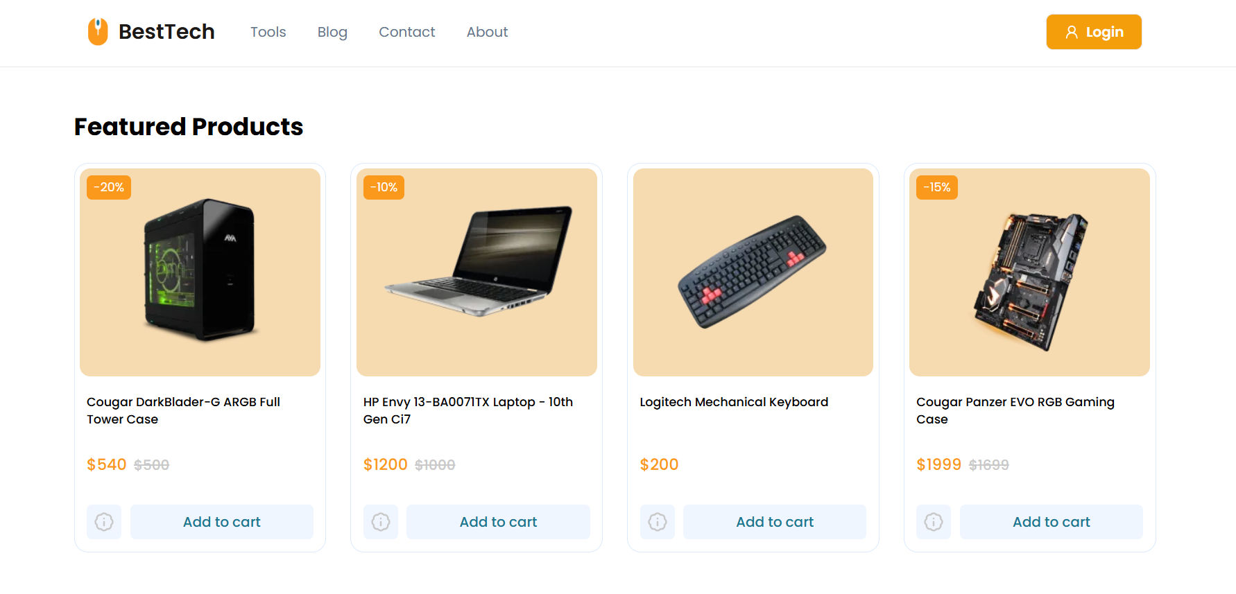
Featured Products
 -20%
-20%Cougar DarkBlader-G ARGB Full Tower Case
 -10%
-10%HP Envy 13-BA0071TX Laptop - 10th Gen Ci7

Logitech Mechanical Keyboard
Product List Preview
How is it organized and structured?
-
To display multiple products, the
ProductListcomponent utilizes theProductCardcomponent. -
From the above product card component, we exported
ProductTypeand using that type here to avoid repetition. -
In this product list component, we added responsiveness for the product list. This component is also reusable and can be used in multiple places in the app.
-
Then you can import and use
ProductListcomponent into your app/parent component. You can also replace the staticproductsarray data with API data.
Features of the Product Card Component
- Discount Badge: Display discounts prominently for promotional offers.
- Transparent Images: Ideal for products with transparent backgrounds.
- Product Info: View more details with a click of the info icon.
- Add-to-Cart Button: Add items to the cart from the card.
In the above code, you can add additional components like the Navbar, Footer, and Newsletter, all designed to enhance the overall layout of your website.
Did it help? give me a follow on LinkedIn.