
React Tailwind Accordion Component
An accordion is a vertically stacked list of items, where each item can be "expanded" or "collapsed" to show or hide content. It's a user interface pattern commonly used to organize large amounts of information into sections.
Think of it as a way to hide or reveal answers under a question or toggle details only when the user wants them.
Common Use Cases
- FAQs (Frequently Asked Questions)
- Product Feature Sections
- Terms and Conditions
- Sidebar filters in dashboards or eCommerce
- Show/hide sections in mobile UI
React Tailwind Accordion
Here’s a clean, accessible accordion component built with React and styled using Tailwind CSS. The entire header is clickable, and it maintains good semantic HTML structure using a <button> element.
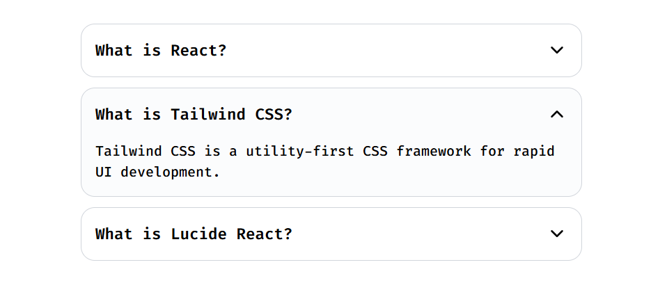
Accordion Preview
Accordion Component Code
React is a JavaScript library for building user interfaces.
Tailwind CSS is a utility-first CSS framework for rapid UI development.
Lucide React is an icon library that provides beautifully crafted SVG icons as React components.
📚 Further Resources
If you want to build a FAQ section using this accordion. You can find the complete component here 👉