

Flexible React Divider Component with Tailwind CSS
A good divider helps break content into sections in a clean way. This React divider component, built with Tailwind CSS, lets you customize it with single or double lines and add text in between. Just copy the code and use it in your project easily!
Divider Component with Single or Double Line

React Multiline Divider Component Code
🎨 Customization Options
- Change Line Style: Modify
border-dottedin the component toborder-solidorborder-dashedfor a different look. - Adjust Thickness: Change
border-y-2orborder-t-2toborder-y-4orborder-t-4for a thicker line. - Change Color: Override the
border-blackclass withborder-gray-500,border-red-500, etc.
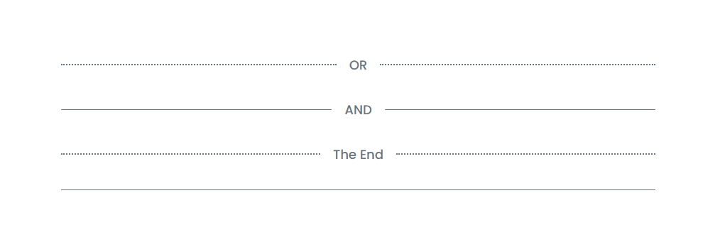
Horizontal Divider with Label
React Horizontal Divider with Label Code
🎨 Customization Options
- Change Line Style
- Replace
border-dottedwithborder-solidorborder-dashedfor different line styles.
1<Divider label="OR" dotted={false} />
- Adjust Line Thickness
- Modify
border-t-2toborder-t-4for a thicker line.
1<Divider label="OR" className="border-t-4" />
- Change Text Style
- Customize text color, size, or font using Tailwind classes.
1<Divider label="OR" className="text-lg font-semibold text-gray-600" />
- Customize Divider Spacing
- Adjust
my-8for vertical spacing.
1<Divider label="OR" className="my-4" />
- Change Line Color
- Replace
border-blackwithborder-gray-500or any Tailwind color.
1<Divider label="AND" className="border-gray-400" />
Found this article helpful? Let’s connect!
If you need more React/Next.js components or have any questions, feel free to reach out.