
React Custom Dropdown Component with Tailwind CSS
Dropdowns are essential UI components for selecting options in forms, filters, and menus. They enhance user experience by keeping the interface clean and organized. With a well-designed dropdown, users can quickly find and select what they need, improving overall navigation and experience.
In this docs, you will get the code for React custom dropdown component styled with Tailwind CSS. This dropdown is accessible, responsive, and easy to integrate into any project.
Dropdown Component UI
Here’s what the dropdown looks like:
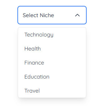
React Tailwind Custom Dropdown Code
How to Use Custom Dropdown Component
- Add the Dropdown Component:
Import the dropdown component into your React project:
1import Dropdown from './Dropdown'
- Provide Options:
Pass an array of options to the component as a prop:
1const categories = ['Web Development', 'AI & ML', 'Cybersecurity', 'Cloud Computing']
2
3<Dropdown options={categories} />
Dropdown Component Features
- Customizable Options & Placeholder:
- The
optionsprop allows passing a list of dropdown items. - The
placeholderprop sets the default text before selection.
- The
- State Management:
selectedOptionstores the currently chosen item.isVisibletracks the dropdown’s open or closed state.
- Outside Click Handling:
- Uses
useEffectto detect clicks outside the dropdown and close it. - The
dropdownRefensures only external clicks trigger closing.
- Uses
- Dropdown Interaction:
- Clicking the button toggles the dropdown menu.
- Selecting an option updates the
selectedOptionstate, triggers theonChangecallback, and closes the dropdown.
- Customization & Accessibility:
- Accepts an optional
classNameprop for styling flexibility. - Includes
aria-expanded,aria-controls, andaria-selectedfor better accessibility.
- Accepts an optional
- Visual Enhancements:
- The
ChevronDownicon rotates when the dropdown is open. - Hover and focus effects improve user experience.
- Displays "No options available" if the options list is empty.
- The
To modify the component, update:
- The
optionsprop to change the dropdown items. - The
placeholderprop for default text. - The
classNameprop for custom styles. - The
onChangecallback to handle selection events.
Looking for more ready-to-use React components? Explore FlexyUI for more beautiful and functional components!