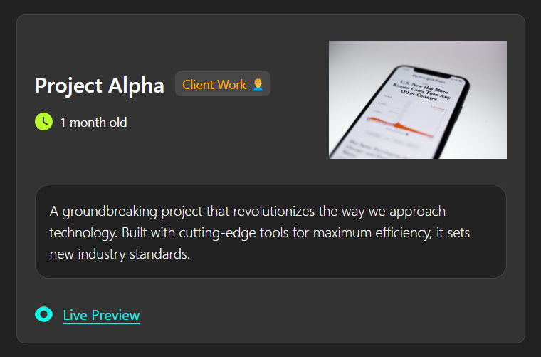
React Tailwind Project Card Component

Every developer needs a portfolio, and a portfolio is incomplete without showcasing projects.

Today, I'll share a project card for your portfolio that stands out from the typical components available online.

Project Card Component Features

  1. Project Image (cover)
  2. Project Stats
  3. Project Description
  4. Action Buttons

UI for Project Card

project card component ui

Component Dependency

In this component, I am using custom icons that can be found in the project's GitHub repository.

Tailwind Project Card Code

The component is built with TypeScript and accepts the following props:

  1. title
  2. description
  3. cover
  4. live preview (optional)
  5. GitHub link (optional)
  6. project type (client, new, cofounder, etc.)
  7. number of visitors
  8. number of stars
  9. number of sales
  10. age
  11. earning
  12. reviews
1import { 2 Earning, 3 GithubDark, 4 Likes, 5 Preview, 6 Star, 7 Timer, 8} from '../../utils/icons' 9 10const IconText: React.FC<{ icon: string; text: string }> = ({ icon, text }) => ( 11 <li className="flex gap-2"> 12 <img src={icon} alt={text} className="w-[18px] md:w-5" /> 13 <span className="text-sm">{text}</span> 14 </li> 15) 16 17interface ProjectCardProps { 18 data: { 19 title: string 20 shortDescription: string 21 priority: number 22 cover: string 23 livePreview?: string 24 githubLink?: string 25 visitors?: string 26 earned?: string 27 githubStars?: string 28 ratings?: string 29 numberOfSales?: string 30 siteAge?: string 31 type?: string 32 } 33} 34 35const ProjectCard: React.FC<ProjectCardProps> = ({ data }) => { 36 const { 37 title, 38 shortDescription, 39 visitors, 40 earned, 41 ratings, 42 githubStars, 43 numberOfSales, 44 livePreview, 45 githubLink, 46 siteAge, 47 type, 48 cover, 49 } = data 50 51 return ( 52 <div className="rounded-[10px] border border-[#444444] bg-[#333333] p-5"> 53 <div className="flex items-center justify-between gap-2"> 54 <div className="flex-1"> 55 <div className="flex flex-col flex-wrap gap-3 sm:flex-row sm:items-center"> 56 <h3 className="text-xl font-medium sm:text-2xl md:font-semibold"> 57 {title} 58 </h3> 59 {type && ( 60 <span className="h-7 w-fit rounded-md bg-[#FFFFFF1A] py-1 pl-2 pr-1 text-sm text-[#FFA800]"> 61 {type} 62 </span> 63 )} 64 </div> 65 <ul className="mt-4 flex flex-col flex-wrap gap-2 sm:flex-row sm:gap-4"> 66 {(visitors || numberOfSales) && ( 67 <IconText 68 text={(visitors || numberOfSales)?.toString() || ''} 69 icon={Likes} 70 /> 71 )} 72 {siteAge && <IconText text={siteAge} icon={Timer} />} 73 {earned && <IconText text={earned} icon={Earning} />} 74 {(ratings || githubStars) && ( 75 <IconText 76 text={(ratings || githubStars)?.toString() || ''} 77 icon={Star} 78 /> 79 )} 80 </ul> 81 </div> 82 <figure className="flex h-[150px] w-[200px] justify-end overflow-hidden"> 83 <img 84 src={cover} 85 alt="Project Cover" 86 className="h-full w-full rounded-md object-contain" 87 /> 88 </figure> 89 </div> 90 <div className="mb-7 mt-5 rounded-2xl border border-[#444444] bg-[#222222] p-4"> 91 <p className="text-base font-light">{shortDescription}</p> 92 </div> 93 <div className="flex gap-5"> 94 {livePreview && ( 95 <a 96 href={livePreview} 97 className="flex gap-2 text-sm text-[#18F2E5] underline underline-offset-[3px] transition-all duration-75 ease-linear hover:scale-105 md:gap-3 md:text-base" 98 target="_blank" 99 > 100 <img 101 src={Preview} 102 alt="monthly visitors" 103 className="w-[18px] md:w-5" 104 /> 105 <span>Live Preview</span> 106 </a> 107 )} 108 {githubLink && ( 109 <a 110 href={githubLink} 111 className="flex gap-2 text-sm text-[#18F2E5] underline underline-offset-[3px] transition-all duration-75 ease-linear hover:scale-105 md:gap-3 md:text-base" 112 target="_blank" 113 > 114 <img 115 src={GithubDark} 116 alt="monthly visitors" 117 className="w-[18px] md:w-5" 118 /> 119 <span>Github Link</span> 120 </a> 121 )} 122 </div> 123 </div> 124 ) 125} 126 127export default ProjectCard

Points to be noted

  1. I have extracted the icon component into a reusable component named IconText.
  2. I am importing all the SVGs from a common utility file to make updates easier and save some lines of code.
  3. Since the project is built in dark mode, I have added background and text colors in the index.css file for the body.
1body { 2 @apply bg-[#222222] text-white; 3}

Usage: Project Card in Action

You have the flexibility to render and display the project card component as you see fit, whether by stacking them or using a grid layout.

Project cards section in portfolio

I have extracted all the project data and added it to the appData folder to make our code cleaner and address points of concern.

1import { projects } from './appData' 2import ProjectCard from './components/ProjectCard/ProjectCard' 3 4function App() { 5 return ( 6 <div className="mx-auto max-w-[1200px] px-3 py-10"> 7 <h2 className="text-3xl font-semibold tracking-wider">Projects</h2> 8 <hr className="mb-8 mt-4 h-px border-0 bg-[#18F2E5]"></hr> 9 <div className="grid grid-cols-1 gap-x-8 gap-y-8 md:grid-cols-2"> 10 {projects.map((project) => ( 11 <ProjectCard data={project} /> 12 ))} 13 </div> 14 </div> 15 ) 16} 17 18export default App

Project data

Here is the project data in case you are interested.

1export const projects = [ 2 { 3 priority: 1, 4 title: 'Project Alpha', 5 shortDescription: 6 'A groundbreaking project that revolutionizes the way we approach technology. Built with cutting-edge tools for maximum efficiency, it sets new industry standards.', 7 cover: 8 'https://images.unsplash.com/photo-1585282263861-f55e341878f8?q=80&w=2070&auto=format&fit=crop&ixlib=rb-4.0.3&ixid=M3wxMjA3fDB8MHxwaG90by1wYWdlfHx8fGVufDB8fHx8fA%3D%3D', 9 livePreview: 'https://example.com/alpha', 10 type: 'Client Work 🙍‍♂️', 11 siteAge: '1 month old', 12 }, 13 { 14 priority: 2, 15 title: 'Project Beta', 16 shortDescription: 17 'Project Beta is a static technical blog site built with GatsbyJS. I share tips on topics like building reusable components in React, explaining JavaScript methods and concepts, Node.js scripts, and more.', 18 cover: 19 'https://plus.unsplash.com/premium_photo-1663040328859-48bddaa9dfeb?q=80&w=2070&auto=format&fit=crop&ixlib=rb-4.0.3&ixid=M3wxMjA3fDB8MHxwaG90by1wYWdlfHx8fGVufDB8fHx8fA%3D%3D', 20 livePreview: 'https://example.com/beta', 21 visitors: '8K Visitors', 22 earned: '$400 Earned', 23 }, 24 { 25 priority: 3, 26 title: 'Project Epsilon', 27 shortDescription: 28 'A collection of engaging coding challenges designed to help developers improve their ReactJS skills by writing functional business logic. Your task is to make it functional by writing business logic, to improve your frontend skills', 29 cover: 30 'https://plus.unsplash.com/premium_photo-1661700152890-931fb04588e6?q=80&w=2070&auto=format&fit=crop&ixlib=rb-4.0.3&ixid=M3wxMjA3fDB8MHxwaG90by1wYWdlfHx8fGVufDB8fHx8fA%3D%3D', 31 32 type: 'Free 🔥', 33 livePreview: 'https://example.com/epsilon', 34 githubLink: 'https://github.com/example/ReactJS-Coding-Challenges', 35 githubStars: '40 Stars', 36 numberOfSales: '138 Sales', 37 }, 38 { 39 priority: 4, 40 title: 'Ejucationzz', 41 shortDescription: 42 'Ejucationzz is a directory site I created for myself using Next.js. On Ejucationzz, you can find free and paid online and offline courses available in Pakistan. 14 academies and 12 main categories, each with subcategories, have been listed.', 43 cover: 44 'https://images.unsplash.com/photo-1527334919515-b8dee906a34b?q=80&w=2070&auto=format&fit=crop&ixlib=rb-4.0.3&ixid=M3wxMjA3fDB8MHxwaG90by1wYWdlfHx8fGVufDB8fHx8fA%3D%3D', 45 type: 'New 🔥', 46 livePreview: 'https://example.com/Ejucationzz', 47 siteAge: '4 months old', 48 visitors: '100 Visitors', 49 githubLink: '', 50 earned: '', 51 }, 52]

If this component helps you in your project and you have any component requests, feel free to contact me on LinkedIn.


Flexy UI Newsletter

Build better and faster UIs.Get the latest components and hooks directly in your inbox. No spam!